Statistics Unit 4: Data Visualization and Misleading Representation of Information
This unit covers more broadly some of the pitfalls of visualization and interpretation of data and statistical information. This will help frame the statistical tests we use in upcoming units and provide a sense of why they are structured as they are.
The book How to Lie With Statistics is also an excellent resource on the topics covered in this unit.
(Note: newer editions have been updated, but older editions of the book, which was originally published in 1954, do not conform to modern language standards for race and gender.)
Section 1: The Usefulness of Visualization
Section 2: Visualization with an agenda!
While it may appear that graphs and other visual presentations of data are objective and factual, they are one of the most common ways in which data are presented with an agenda. One of the best ways to understand the presentation and interpretation of scientific data is to become good at examining graphs.
Typically, graphs are presented with the independent variable on the x-axis and the dependent variable on the y-axis. Graphs are objective in the sense that they typically only present objective, uninterpreted data. However, there are a variety of ways in which the presentation of graphs can be misleading or contain an agenda. Here are some examples:
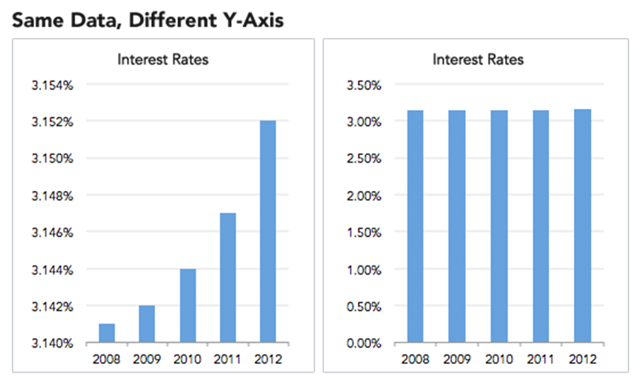
(Source Unknown)
The above two graphs present the same information about changes in interest rates over the course of a five-year period. If I showed you the graph on the left and asked you how interest rates are changing, you would probably remark that interest rates have skyrocketed over the past five years! Huge changes in interest rates from 2008-2012! If I showed you the graph on the right, you would say that interest rates have held steady over this five-year period.
Remember, these graphs depict identical data. So, which one is correct? They both are! A cautious examiner would look at these graphs and determine whether changes going from 3.145% to 3.152% are meaningful. For some contexts, maybe this is extremely negligible. For other contexts, this could potentially mean billions of dollars of changes in financial activity. The data themselves do not contain this context. Instead, we must always consider the scale and meaning.
“The individual source of the statistics may easily be the weakest link.” – Josiah Stamp
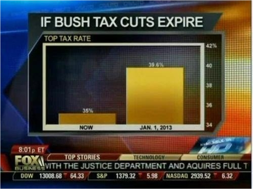
FOX Business presented this graph examining the potential effects of ending the Bush-era tax cuts. A quick glance at this graph makes it appear that taxes might grow five times as large if the cuts expire. In fact, the actual change is 35% to 39.6%. Additionally, most people do not realize that this only applies to earnings in the highest bracket. Is this increase large and meaningful? Depends again on context. It is large and meaningful for people earning a lot of money, but that context is easily lost from the graph itself. Does the graph fairly represent the data? I would argue it does not, even though nothing is inherently “wrong” about it.
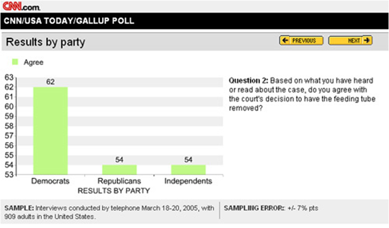
CNN presented this graph examining a controversial ethical issue by party lines. A quick glance would indicate that Democrats vastly favored the court’s decision in this case, whereas Republicans and Independents were against it. In fact, all three groups held a majority in favor of the decision. Only 8% more Democrats favored the decision than the other two groups. Additionally, the survey cites a sampling error of +/-7%.
That means, each group percentage is most likely (probably 95% likely as discussed in the previous unit’s section on confidence intervals, though they do not specify what sampling error means and there is no absolute definition without more information) within +/-7 points. So, within our comfort level of error, the Democrats could be as low as 55% and the Republicans and Independents as high as 61%. Are we really sure there is a difference in these groups? Statistically speaking, most likely not. However, the graph implies that there is a large and clear difference. Again, not “wrong,” but certainly potentially misleading.
“There are two kinds of statistics, the kind you look up and the kind you make up.” – Rex Stout
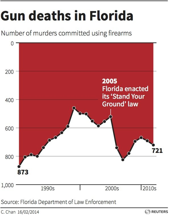
The above graph from Reuters shows gun deaths in Florida with a note of when the “Stand-Your-Ground” law, which explicitly permits more force to be used against threats or perceived threats, was enacted. A quick glance as this graph would seem to show that gun deaths rose quickly throughout the 90s, became relatively steady through the mid 2000s and then fell drastically immediately upon the enactment of Stand-Your-Ground law before remaining relatively steady into the present. We know that correlation does not imply causation and other factors beyond Stand-Your-Ground may be at play, but there’s something more sneaky here. Did you notice it? Rises in the curve on the y-axis indicate decreasing gun deaths and declines in the curve indicate increasing gun deaths. Does that change your interpretation of these data? Was it presented this unintuitive way with a specific agenda?
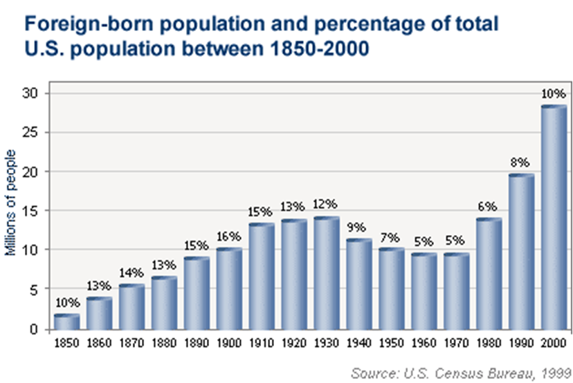
The above graph shows the size of the foreign born population in the United States from 1850 to 2000. Again a quick glance would indicate that between 1990 and 2000 especially, foreign-born people flocked to the United States creating a very large foreign-born population. But as you might expect by now, there is something sneaky here. The graph shows us foreign-born people in the United States by numbers. Above each of the bars, there is a percentage noting what percent of the population those foreign-born people comprise. So, in fact, the growth in numbers of foreign-born people in the United States from 1990 to 2000 was not at a much faster rate than the growth of the population as a whole. In fact, the foreign-born composition of the United States was higher from 1850 through 1930.
Depending on your feelings about foreign-born people in the United States, you may choose to present this graph with a y-axis showing number of people who were born in another country or you might decide to present it as the percentage of the population born in a foreign country. Either presentation is objective and factual, but the conclusion a casual reader will draw from each might differ quite a lot! In either case, there is an inherent agenda or implication depending on presentation.
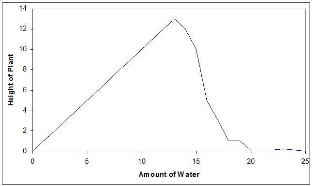 This particular graph is just something I invented. I did not conduct this experiment, but it is associated with a true phenomenon. If you water a plant more, it will grow better. However, at some point, over-watering a plant actually harms it. In fact, if you really overwater the plant, it will not grow at all. The above is a graph showing plant height on the y-axis and the amount of water on the x-axis depicts this phenomenon.
What if instead, I only plotted the first portion of the graph.
You might then conclude that adding more water is always going to make the plant grow taller! That makes sense (so I haven’t included it here).
How about the second section only?
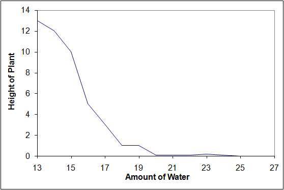
Adding water to a plant makes it grow less. I can see the breaking news item now, “Scientist says water is harmful to plants!”
It is quite easy for me to present the information completely or partially, and that might change the conclusions drawn from it. This may not be intentional. It is also possible that my experiments only covered the presented portion of the range. I might then draw the wrong conclusion from my results and generate an incorrect theory. Further scientific inquiry to fill in the missing part of the range would be needed to yield new evidence, thereby invalidating my theory.
“An unsophisticated forecaster uses statistics as a drunken man uses lamp-posts – for support rather than for illumination.” – Andrew Lang
Section 3: More on Misleading Interpretations of Data
A satire about using statistical information to draw silly conclusions
Simpson’s Paradox
(A lot of this example taken from the excellent summary in the current Wikipedia article on Simpson’s Paradox)
Simpson’s paradox is a phenomenon in probability and statistics, in which a trend appears in different groups of data but disappears or reverses when these groups are combined. The video below describes it well:
Berkeley gender bias case (covered in the video as well – much of below from the Wikipedia article)
The admission figures for the fall of 1973 showed that men applying were more likely than women to be admitted, and the difference was so large that it was unlikely to be due to chance. (*Keep in mind that these data are from 1973 and do not really apply to current admissions data, but the interesting point is that the conclusion can easily be incorrect depending on how objective data are examined.)
| Applicants | Admitted | |
|---|---|---|
| Men | 8442 | 44% |
| Women | 4321 | 35% |
But when examining the individual departments, it appeared that six out of 85 departments were significantly biased against men, whereas only four were significantly biased against women. In fact, the pooled and corrected data showed a “small but statistically significant bias in favor of women.”
The data from the six largest departments is listed below.
| Department | Men | Women | ||
|---|---|---|---|---|
| Applicants | Admitted | Applicants | Admitted | |
| A | 825 | 62% | 108 | 82% |
| B | 560 | 63% | 25 | 68% |
| C | 325 | 37% | 593 | 34% |
| D | 417 | 33% | 375 | 35% |
| E | 191 | 28% | 393 | 24% |
| F | 373 | 6% | 341 | 7% |
The research paper by Bickel et al. concluded that women tended to apply to competitive departments with low rates of admission even among qualified applicants (such as in the English Department), whereas men tended to apply to less-competitive departments with high rates of admission among the qualified applicants (such as in engineering and chemistry).
As it turns out, as women have shifted since 1973 to applying more frequently to departments that were previously dominated by male applicants, gender bias in admissions has emerged more clearly. The story on this, is of course, very complicated to interpret, and can work in either direction depending on the specific scenario. This is not the type of thing we will examine directly in class, but if you interested, here are a couple of stories from an endless pool of work examining every facet of this topic and drawing any variety of complex conclusions:
At some colleges, your gender – man or woman – might give you an admissions edge (Washington Post)
Why getting into elite colleges is harder for women (Washington Post)
I specifically give the above example because it illustrates the complexity in taking objective data and applying useful interpretations and applications of it. In some cases, it can be clear and obvious. In others, it is easy to be misled and draw the wrong conclusions.
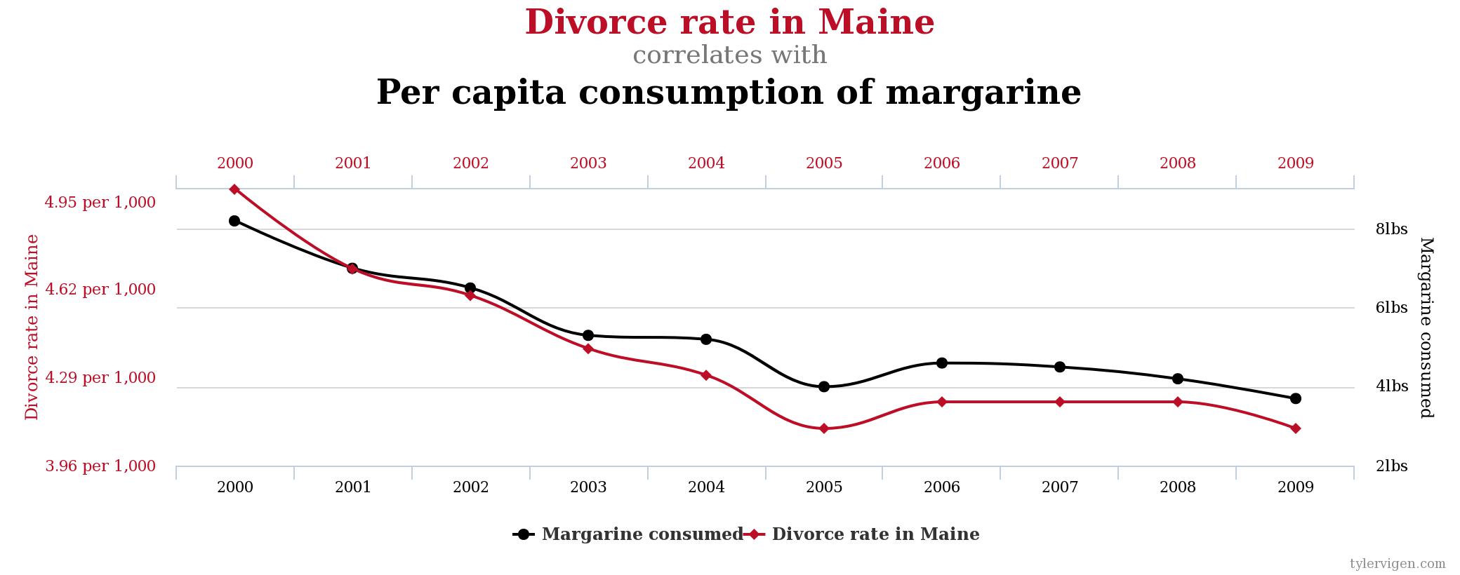
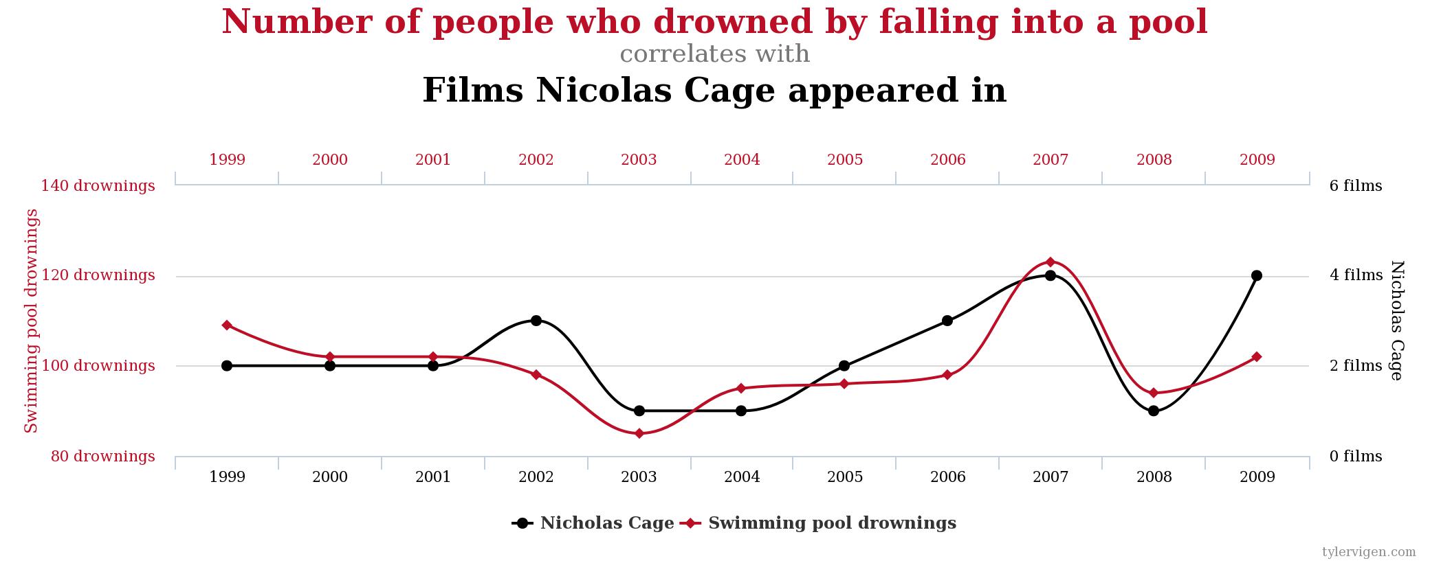
Section 4: Spurious correlations
We will discuss correlations in detail in the next unit, but you should already intuitively have an idea of how we examine the relationships between variables. If we see a relationship, such as watering plants and their growth, and we believe the relationship to be “real,” we describe it as causal. That is, watering plants causes them to grow more.
When we conduct experiments, it is possible for us to find a mathematical relationship that is not causal. We describe this type of relationship as spurious. That is, there is a mathematical tie, but not an actual real-world tie. There is an informal term in science and statistics to describe scouring data for mathematical relationships without having any real sense of underlying theory. We call this kind of search, a “fishing expedition.”
Spurious correlations is a funny book examining some of the results of these kinds of fishing expeditions. While there are demonstrable mathematical relationships in the datasets, we intuitively know that it is silly to believe that the two metrics are related. Here are a few:

Section 5: Sampling errors